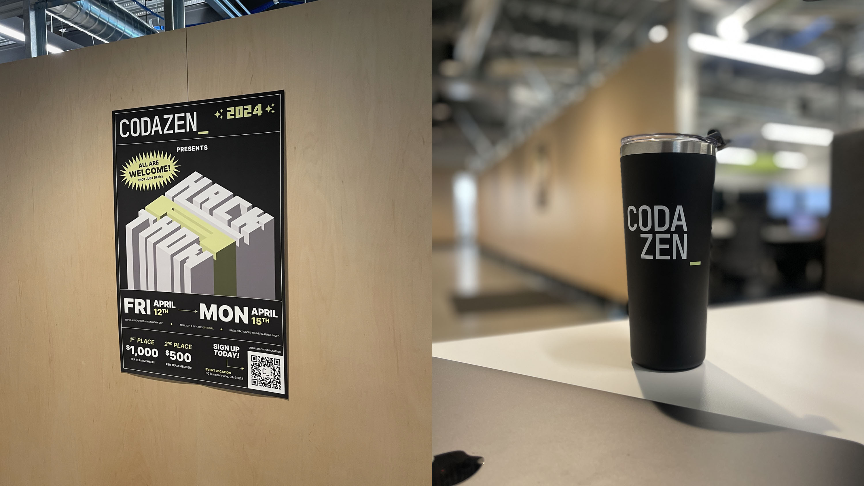
A ground-up rebrand for Codazen, a digital product consultancy — a new wordmark, visual language, and applied identity system built to signal engineering credibility and creative range across every touchpoint, from business collateral to the building itself.
Branding
Logo Design
Art Direction
Brand Designer · Art Director


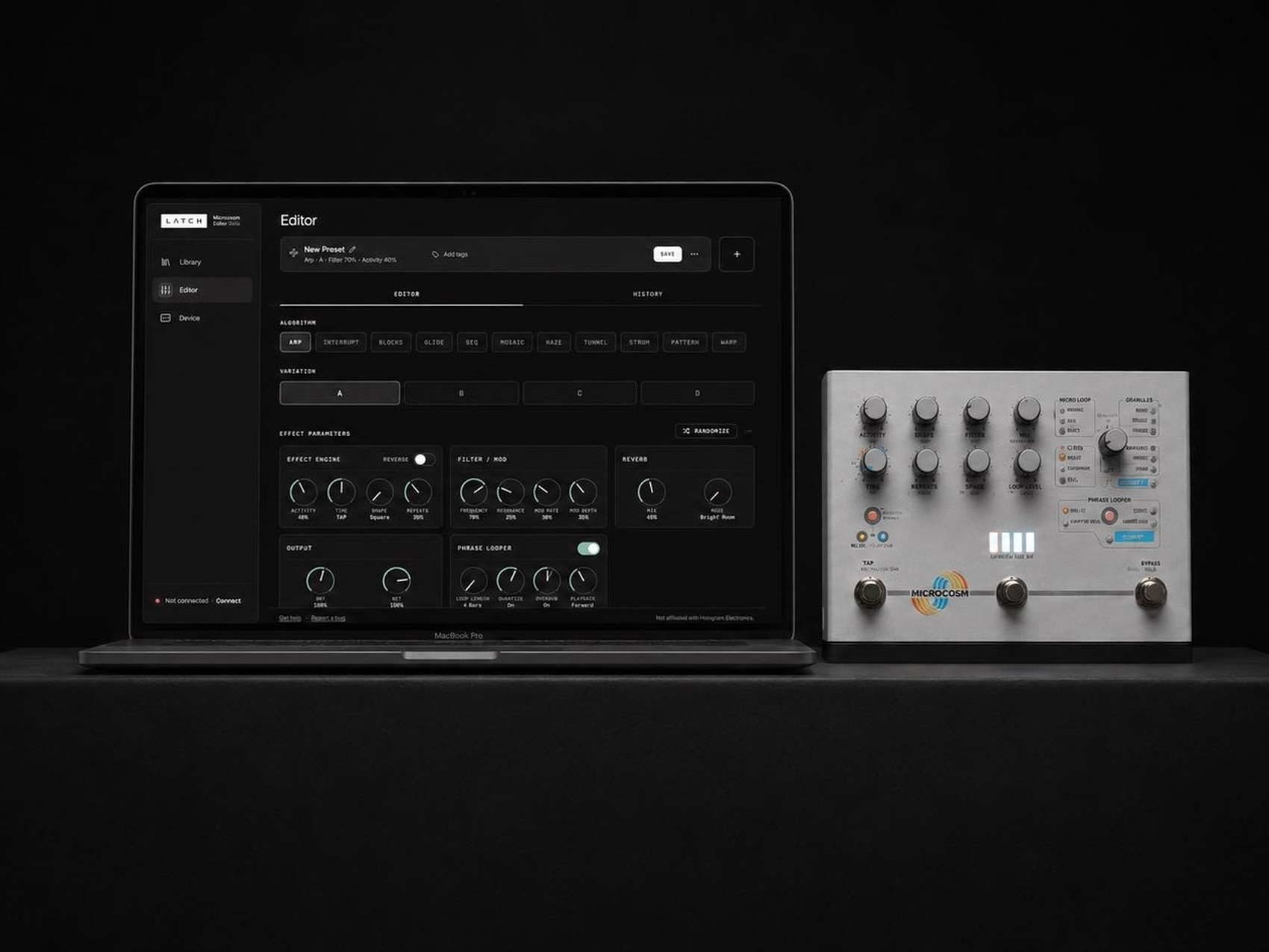
Validating and building a browser-based Microcosm editor using AI product discovery, Claude Code, Cursor, and Figma.
All rights reserved